if I didn’t know better, at a glance I’d assume this was like a uae national team
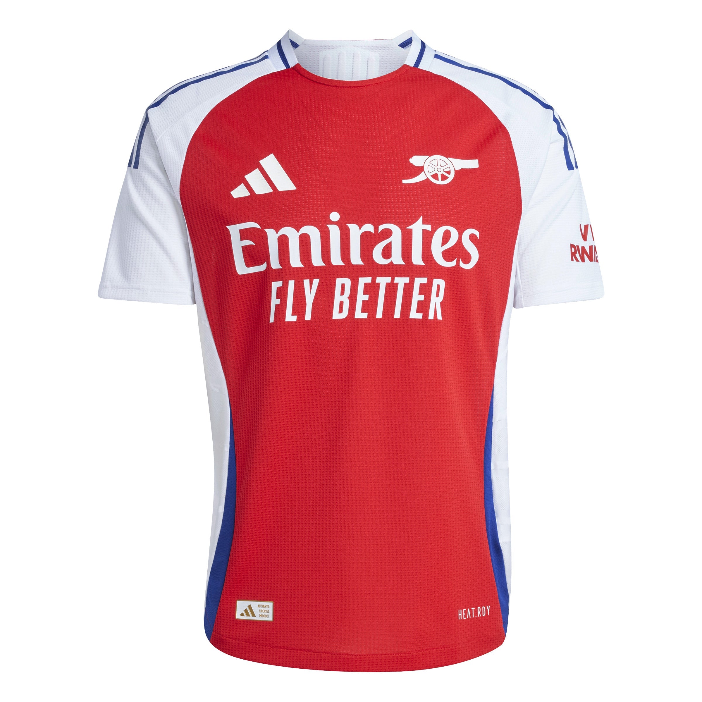
sure it could look worse, but having big advertisements front and center doesn’t look good
↩ repost
Bro does not know what he’s on about 🔥🔥🔥
name me 1 football jersey that has an obstructive sponsor that isn’t from the Colombian third division
↩ repost
Hot take? Soccer/Football jerseys suck. All modern football jerseys are just advertisements, which look corny and ugly. Sports like basketball, baseball, American football, etc have clean and simple jersey designs. Yet football jerseys are so obtrusive with all their sponsorships.
↩ repost
I kinda want to get into football (soccer) jerseys - they seem really cool and you can collect ones from different countries
ive gotten so used to seeing ads on cricket jerseys that I don't care about this tbh
colors and font are the main thing