changes to the website i’d like to see (among other things)
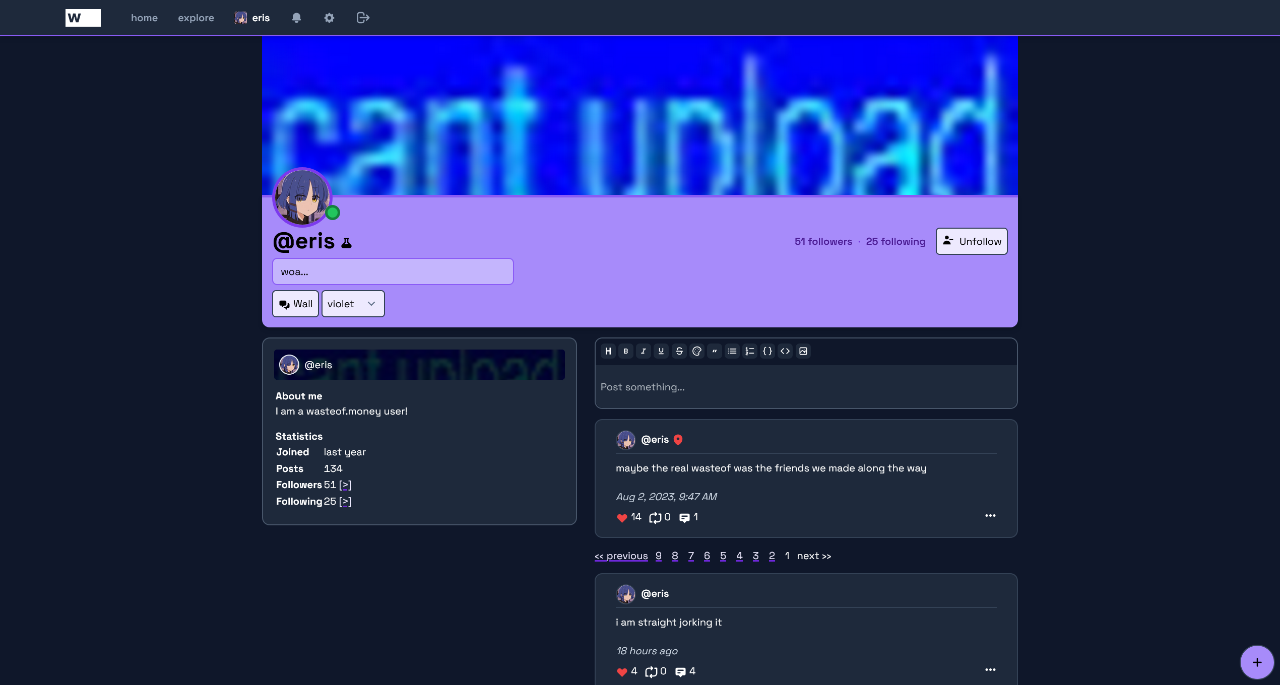
i made some changes to the profile page css (i hate tailwind) don’t mind the titlebar being different that was a mistake.
i made some changes to the profile page css (i hate tailwind) don’t mind the titlebar being different that was a mistake.
compliments
i like space grotesk
more profile colours is good
faster website is always good
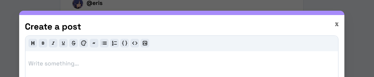
modals look nice. i suggest making the border thickness equal to the radius so theres no weird slight curve around the edges
im sure the 𝕏 is just a joke but please change it sometime
in light mode i suggest making the modal dim not black but a grey colour (light grey with hint of blue looks good imo :yeah:)
other suggestions (or complaints depending on the day)
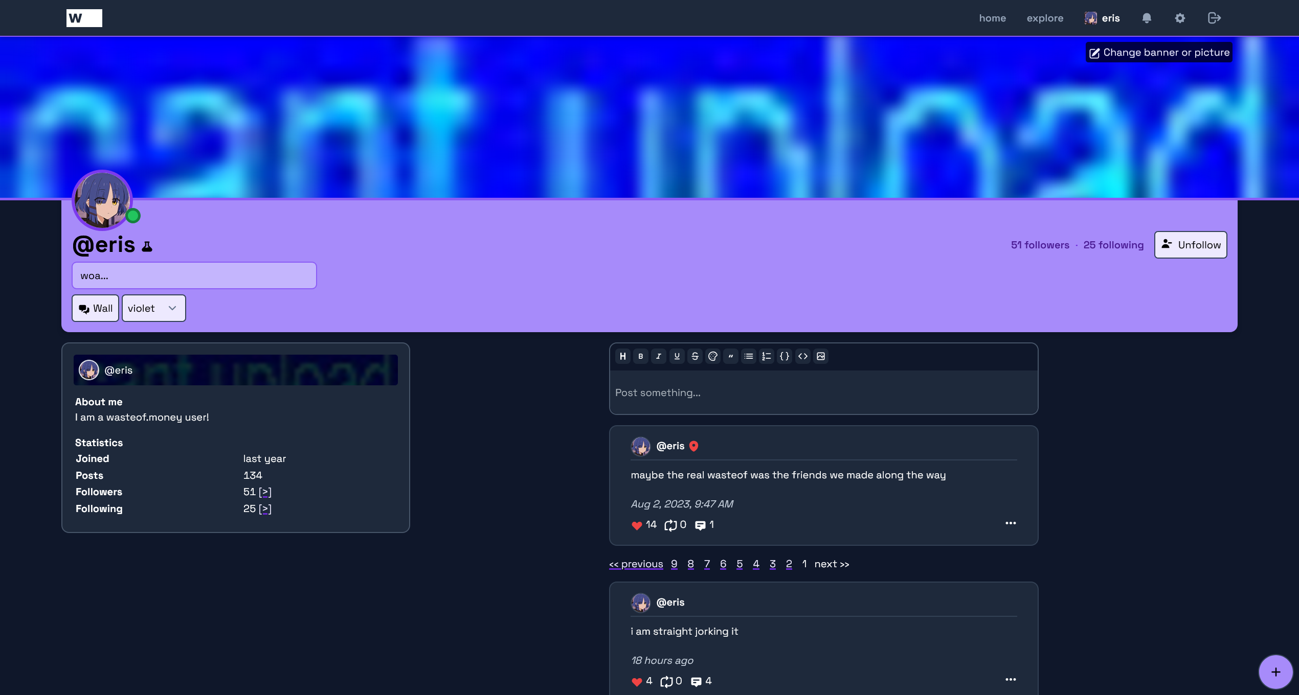
border colour on the pfp on the profile page doesnt match the border color on the banner please make it do
fix the numerous alignment issues
the website theme is too blue to be using the profile colour as an accent (the profile page is almost an exception).
make images better
“the website theme is too blue to be using the profile colour as an accent (the profile page is almost an exception).”
the light theme actually solves this problem, AND uses the profile colour as the accent in a few more places (notably the navbar) i hope this is carried over into the dark theme
if it means changing the entire dark theme leave an option for the old dark theme or something
again i also recommend having two different fonts for display and text
you can keep space grotesk for display (big text) but use something like segoe ui for text (small text, like posts for instance)
https://wasteof.money/posts/67fa0006ffbc0b0562e908be