the fedex logo is by far the greatest logo ever designed
Randomly seeing the arrow for the first time while in the car was like achieving consciousness
I disagree.
and its old too, it was designed 29 years ago (in 1994)
isn’t it just the word “FedEx”
oh wait I haven’t read the comments oops
lol, thats what i thought until i looked up the logo
pointing out the arrow in the Ex was one of my favoutite autism facts to just randomly drop on people
wait am i autistic
maybe
it would explain so much
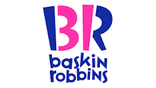
what about Baskin Robbins? (there is a hidden 31 for the 31 flavors they sell)
Not anymore, right? Didn't the logo update last year change that?
Yes the logo changed - but the 31 still remains on the logo - https://en.wikipedia.org/wiki/Baskin-Robbins
the baskin robbins one feels a little forced
even the new one?
the new one feels even more forced
hmm
never noticed there was an arrow in the Ex part
Randomly seeing the arrow for the first time while in the car was like achieving consciousness